Camden Brewery

Camden Town Brewery

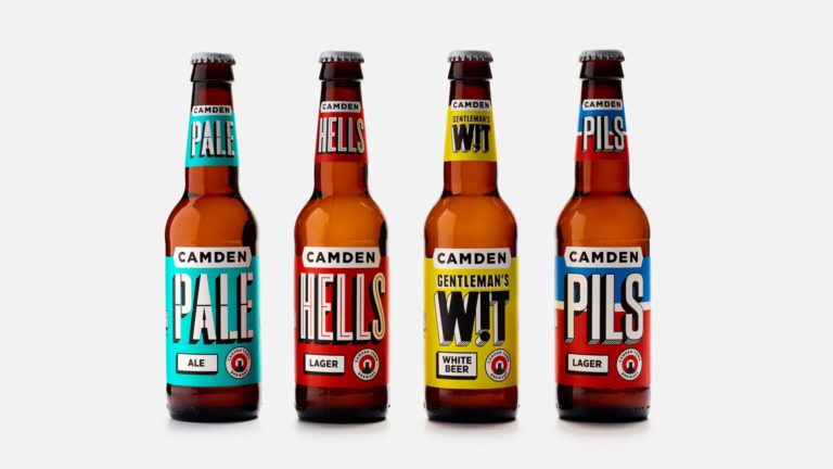
Studio Juice has refreshed the identity of Camden Town Brewery, to create a bold looking brand with packaging that jumps off the shelf. Implemented across its beer packaging, tap badges and advertising, the updated graphics have punchier, bolder colours and bespoke typography across the product range. Each beer name — for example Hells, Pale Ale and […]

Read more

Maru

Maru’s new branding, created by Istanbul based Ogilvy is built on a five-piece isometric grid that creates a legible typeface including numbers and infographic icons. And a mobile app that reads various shapes created within the system was developed to enrich the experience for architects. Maru means “perfection” in Japanese, and the architectural firm that adopted the Maru name […]

Read more

noble rey golden rey

Noble Rey

“Noble Rey creators Dallas brewery approached us to design the initial run of their four flagship beers: Off the Leash, Baracus, Golden Rey and Steampunk. Our initial vision was to craft an illustrated persona for each brew, but the real estate on cans is slim and Texas beer coolers are overcrowded. So we opted to create […]

Read more

Latina TV

Latina – TV

Latina TV is a Peruvian television network. In 2014 the network changed it’s name from Frecuencia Latina to Latina, and the brand has recently undergone a transformation by Lima based agency Brand Lab. They’ve created a dynamic logo that is able to change depending on the content of the programs it’s airing. The strong contrasting colour palette […]

Read more

Edelbrand Series

Edelbrand Series

Creators of the Edelbrand Series, The Vienna Craft Distillery is a place open for experimentation with old, partly forgotten ingredients and natural flavours in order to create unique distillates. Trained engineer Karl turns mysterious alchemy into science. With his inspiration taken from all over the world, the full-time caterer dedicates his passion to capturing nature’s wealth […]

Read more

Personal Group

Personal Group

Personal Group is an employee benefits and financial services company based in the UK who have recently unveiled their new identity created by London based SomeOne.   “SomeOne developed branding based on a smiling face together with a positive golden yellow palette. Yellow is not only the most attention grabbing colour, but is also the […]

Read more

Café De La Corte

Café De La Corte

Café De La Corte is a family owned, single origin coffee farm in Colombia. The branding was created by The Collected Works, a New York based design studio who created a mark that was based on their family crest. “They had a limited budget, so we developed an identity and packaging system that was affordable to produce […]

Read more

Paris Convention and Visitors Bureau

Paris Convention and Visitors Bureau

Paris Convention and Visitors Bureau was created in 1971 at the joint initiative of the Paris City Council and the Paris Chamber of Commerce and Industry*. It carries out three specific missions : Welcome and informing visitors, and promoting the destination in France and abroad. Last July, a consultation was launched to revise the graphic design of […]

Read more

Old Wooden Tooth design

Old Wooden Tooth

Old Wooden Tooth is a limited-edition Russian Imperial Stout that has been ageing in bourbon barrels since the ale house opened last year. It was created to celebrate Taft’s Ale House first anniversary, who are based in the Over-the-Rhine neighborhood of Cincinnati. Taft’s design shop, 1 Trick Pony, teamed up with the folks atSteinhauser, a family owned […]

Read more

YO! Sushi branding

YO! Sushi

YO! Sushi has a new branding designed by London based studio & SMITH. The Idea: YO! Sushi is a place where people can experience a true taste of modern Tokyo. The brand idea and menu launch campaign centred around ‘This is Tokyo’ as a concept. So this meant… We hero-ed the authenticity of the dishes on […]

Read more