30 October, 2017
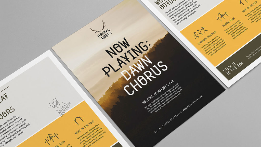
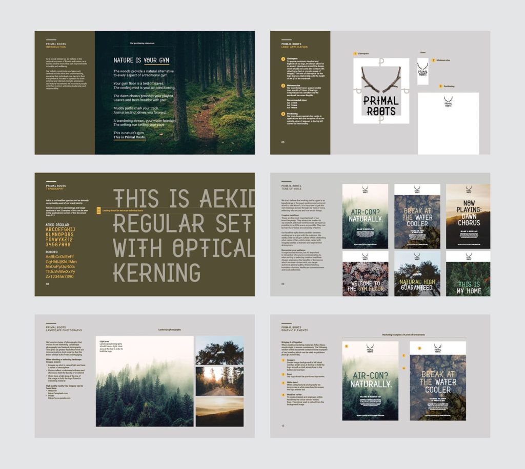
Primal Roots, based in the woodlands of England, is a pioneering fitness and wellbeing bootcamp rooted in a pursuit for external and internal strength, endurance and natural movement. Working closely with charities, they offer fitness services and training to help the recovery of people tackling homelessness, mental health conditions and those who wouldn’t otherwise have access to such services. The team approached Lantern to create a brand identity for the social enterprise, promoting their holistic approach to a broad audience including local authorities, healthcare commissioners and away-day organising HR managers – not to mention fitness fanatics.
![]()
Designed by Lantern, London.
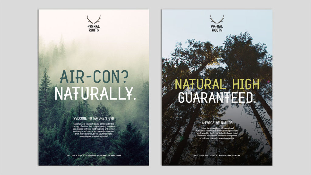
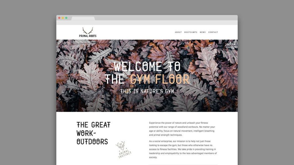
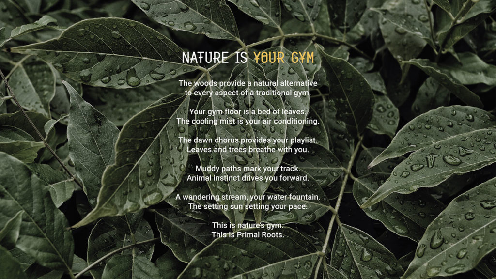
Better outside, better inside. Come rain or shine, the key challenge for the brand was convincing people that exercising outside was an activity worth pursuing – thankfully, science was on our side; “Exercise anywhere is a good thing but exercise in natural environments has a greater benefit for physical and mental health. Woodlands and parks have the greatest effect” – Prof. Richard Mitchell, University of Glasgow. To further address the challenge, we suggested changing the original brand name of Nature’s Gym to something far more emotive – capturing the primitive, raw attitude of the workouts. From a long list of more than 100 names, Primal Roots was selected and the development of the visual and verbal identity began.
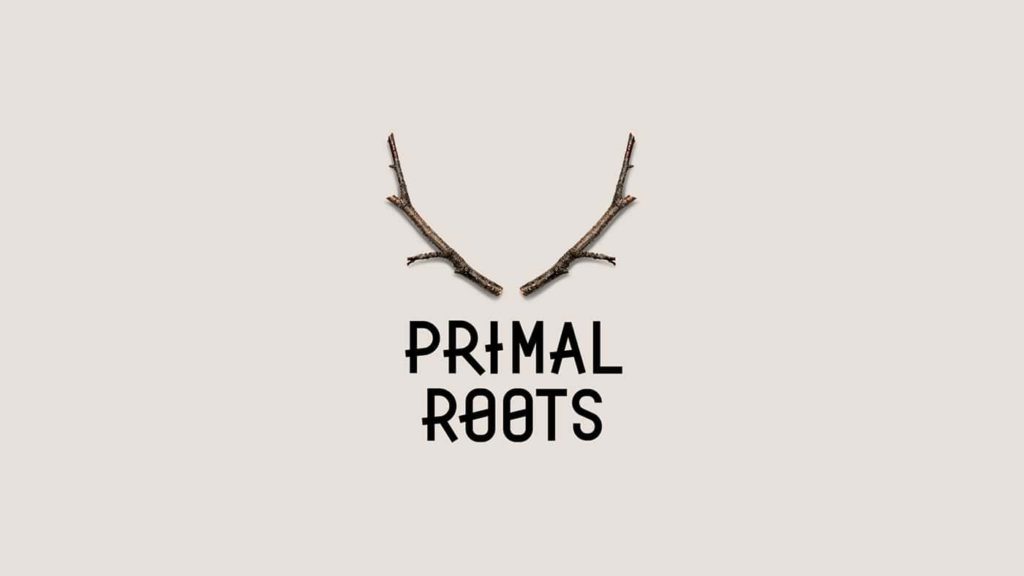
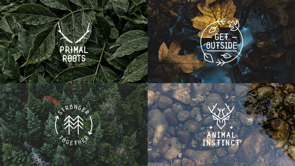
The identity was developed to reflect a drive and animal instinct present in all of us, when interacting and connecting with the natural world. Two sticks positioned as deer antlers, create a mark synonymous with the wild, the lower branches hinting at two eyes, poised to move.


![]()
Comments