16 August, 2018
Branding by Cast Iron Design
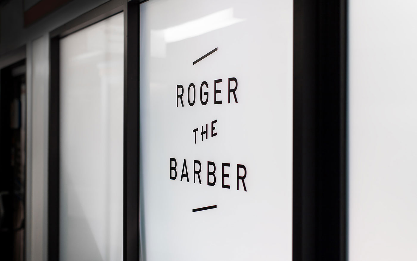
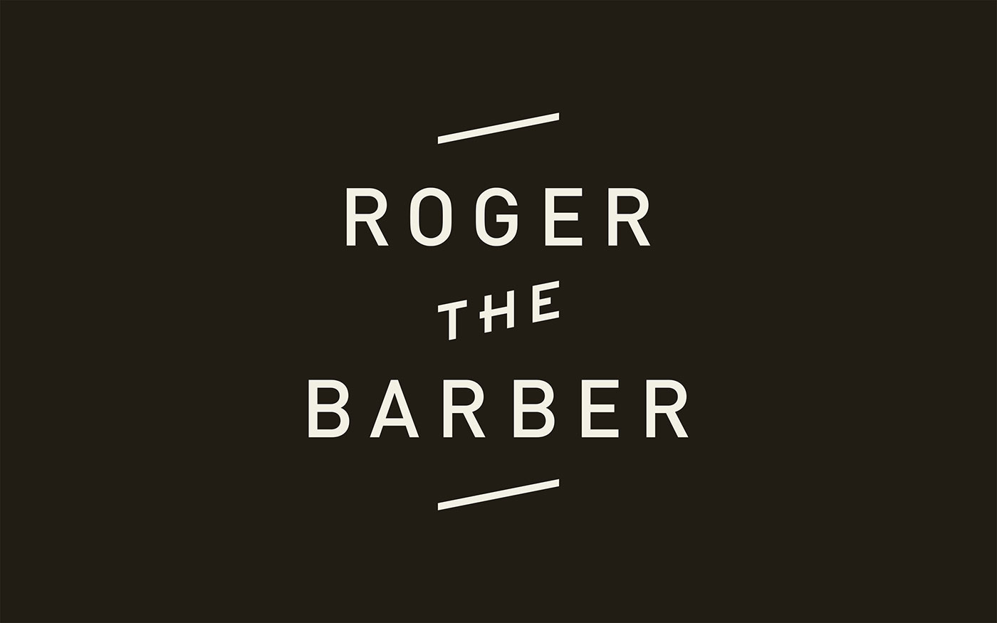
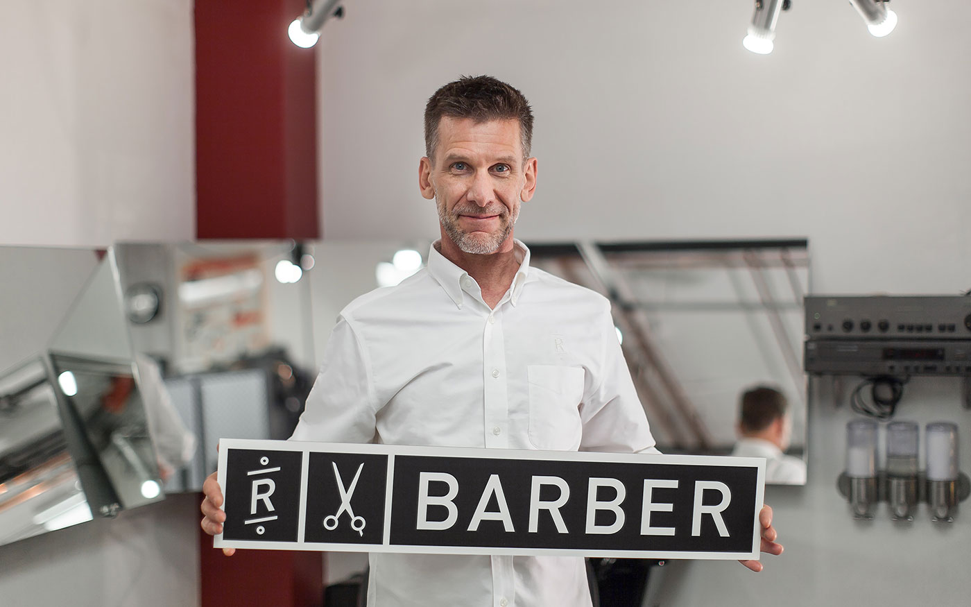
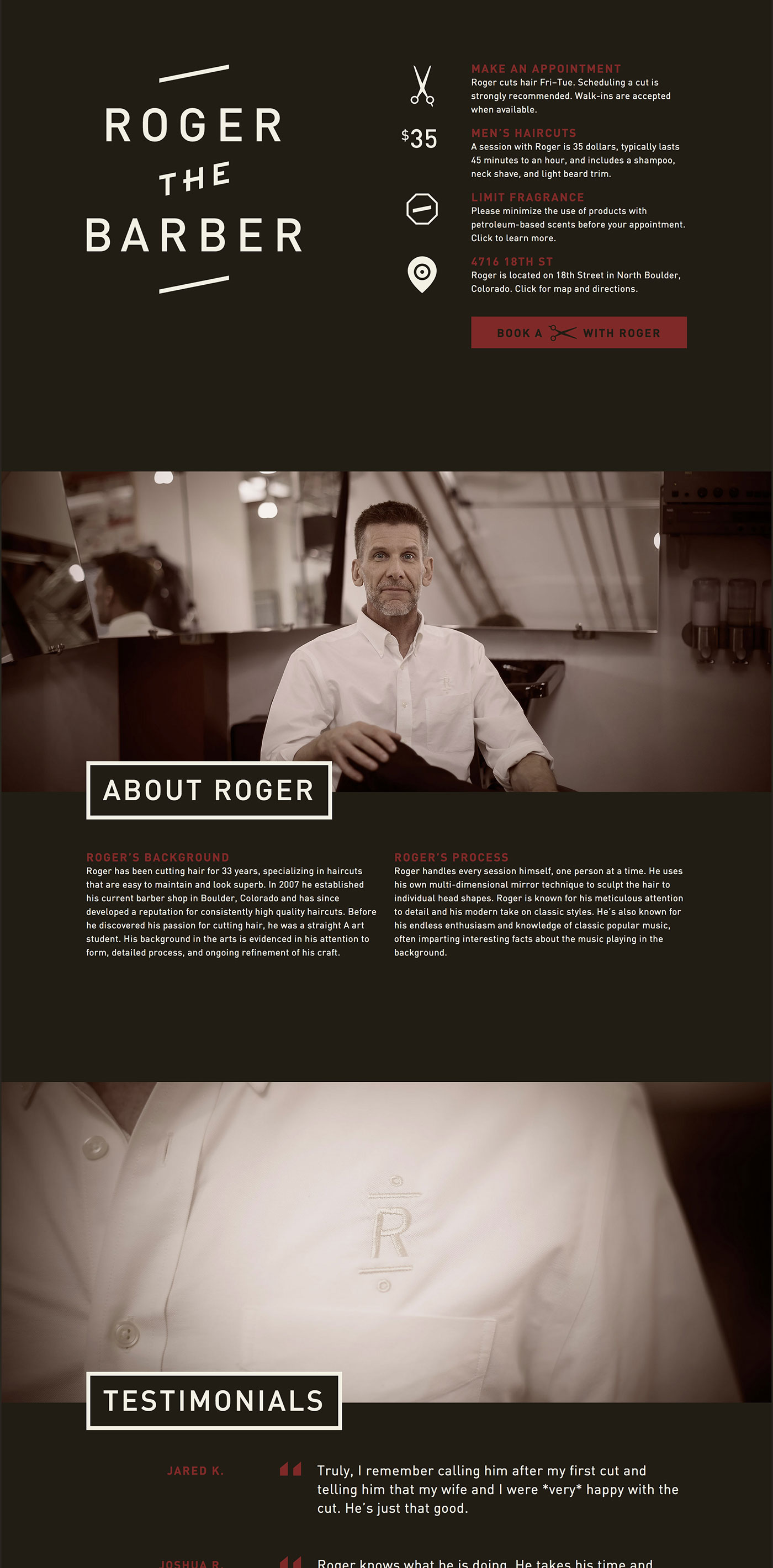
Roger The Barber is a unique and exceptionally talented barber. He doesn’t offer the typical variety of services or array of products one might expect from a barbershop or salon, instead offering a singular service — short cuts without the shortcuts.
Brand identity
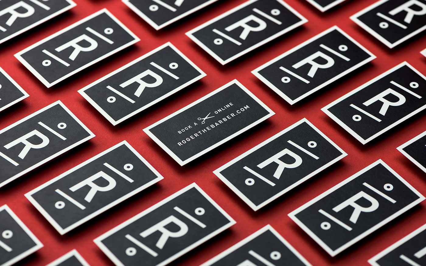
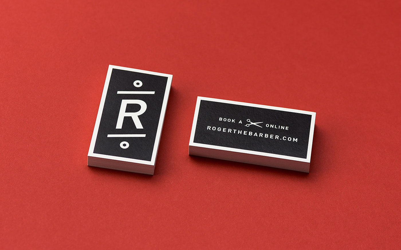
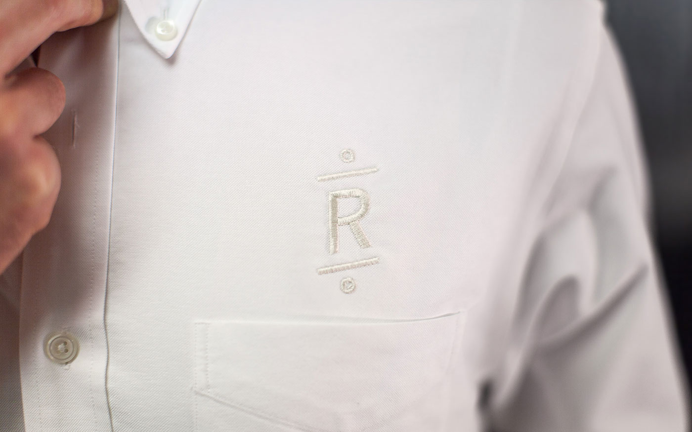
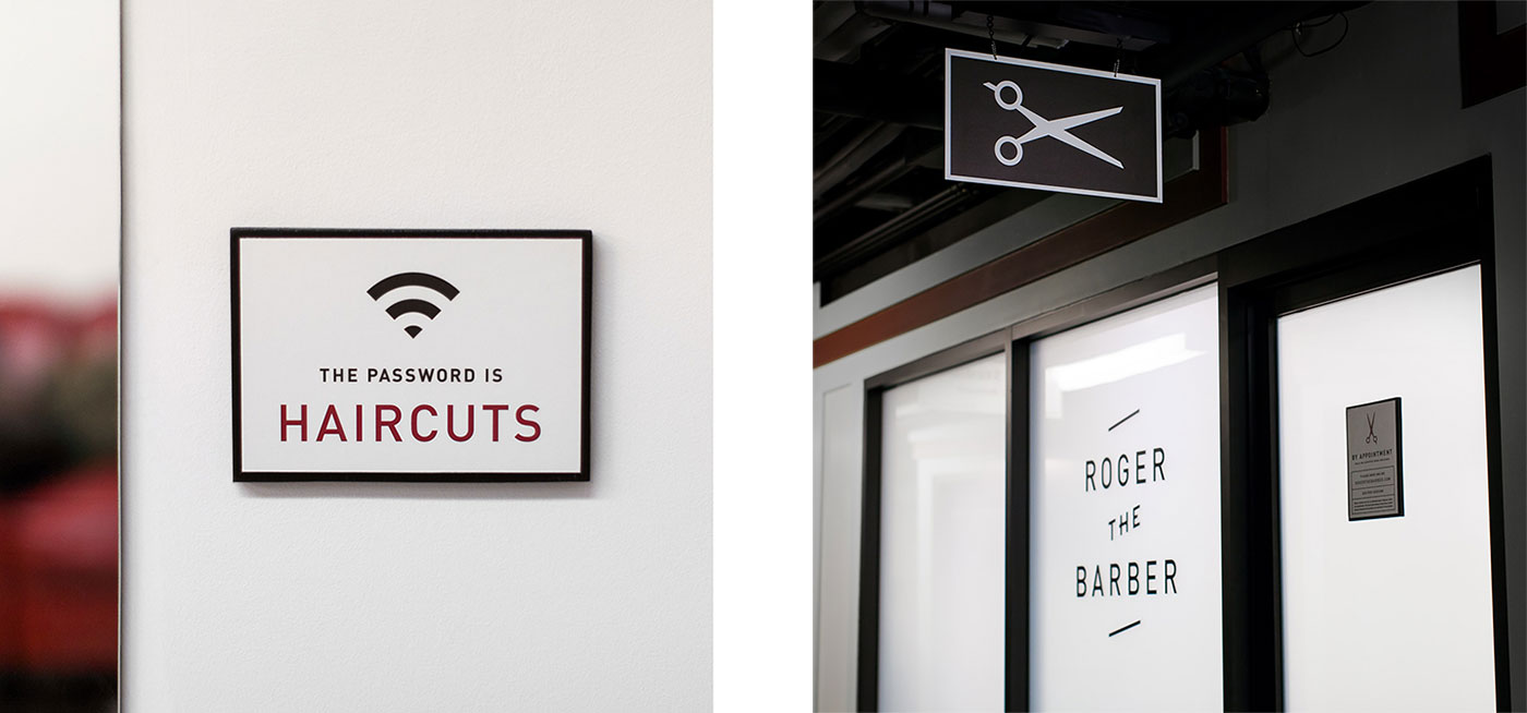
Roger’s logo and monogram allude to the iconic barber pole, striking a balance between his classic approach and modern sensibilities. In our initial discussions, Roger informed us that the tile in his shop was angled at exactly 22.5°. This seemingly trivial detail reflected Roger’s precision and served as a guiding principle — both figuratively and literally — for the creation of his identity. The logos and illustrations adhere to a grid based on halved divisions of 45° (45°, 22.5°, 11.25°), and although invisible to the viewer, this principle helped create an underlying aesthetic uniformity.

Sustainability
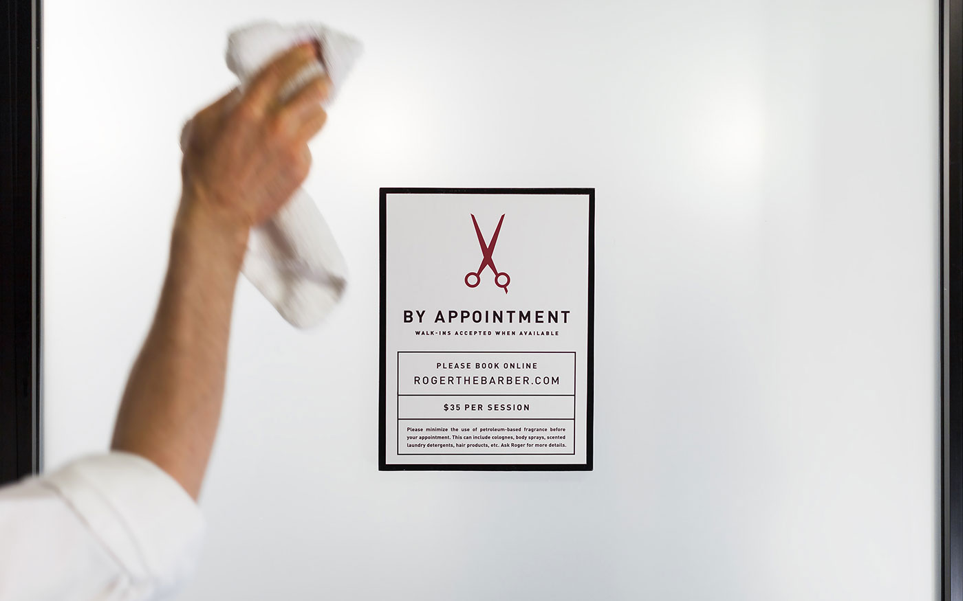
Roger needed a way to direct walk-in customers to his website in order to book an appointment. Our solution was a small, concise, digitally printed card. The small size (1.5˝ × 2.75˝) allowed us to nearly double the amount of cards on a 12˝ × 18˝ press sheet (in comparison to a standard 2˝ × 3.5˝ business card), reducing paper and printing costs. For the paper we specified Mohawk’s “Inxwell Vellum”, a digital-ready stock with a subtle texture that worked well for the small size of the card. (However, due to the fact that it is a softer, bendable stock, we would avoid it for a larger card where rigidity is desired.) We specified the aforementioned stock for two different jobs which we ran simultaneously, saving costs for both clients and minimizing our trips to the printer for quality checks.

Comments