Posted
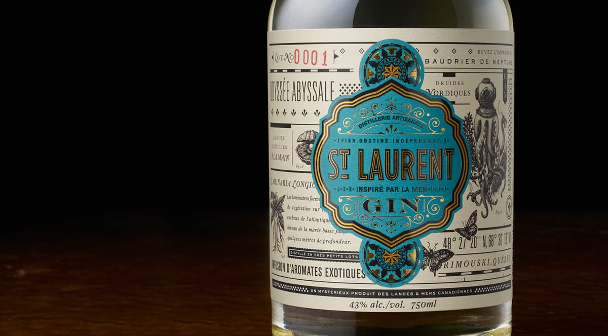
St. Laurent Gin is a handcrafted gin whose essence is 1 part mystery and 1 part discovery. A Canadian gin with a label primarily in French, the design pulls inspiration from author Jules Verne along with visual cues from antique encyclopaedias.
This is yet another beautiful bit of packaging design from Chad Michael Studio, Dallas – if you’re not familiar with any of their work I fully recommend checking them out. The colour palette chosen for this bottle sits really nicely with the liquid inside it. The splash of blue allows the St. Laurent Gin logo to stand out, but has a brilliant balance that means you’re not too distracted from the wonderful illustrations and typography on the rest of the label.
If the gin itself is as expertly crafted as the label, anyone drinking this is in for a treat.


