1 November, 2018
Issho branding by Dutchscot
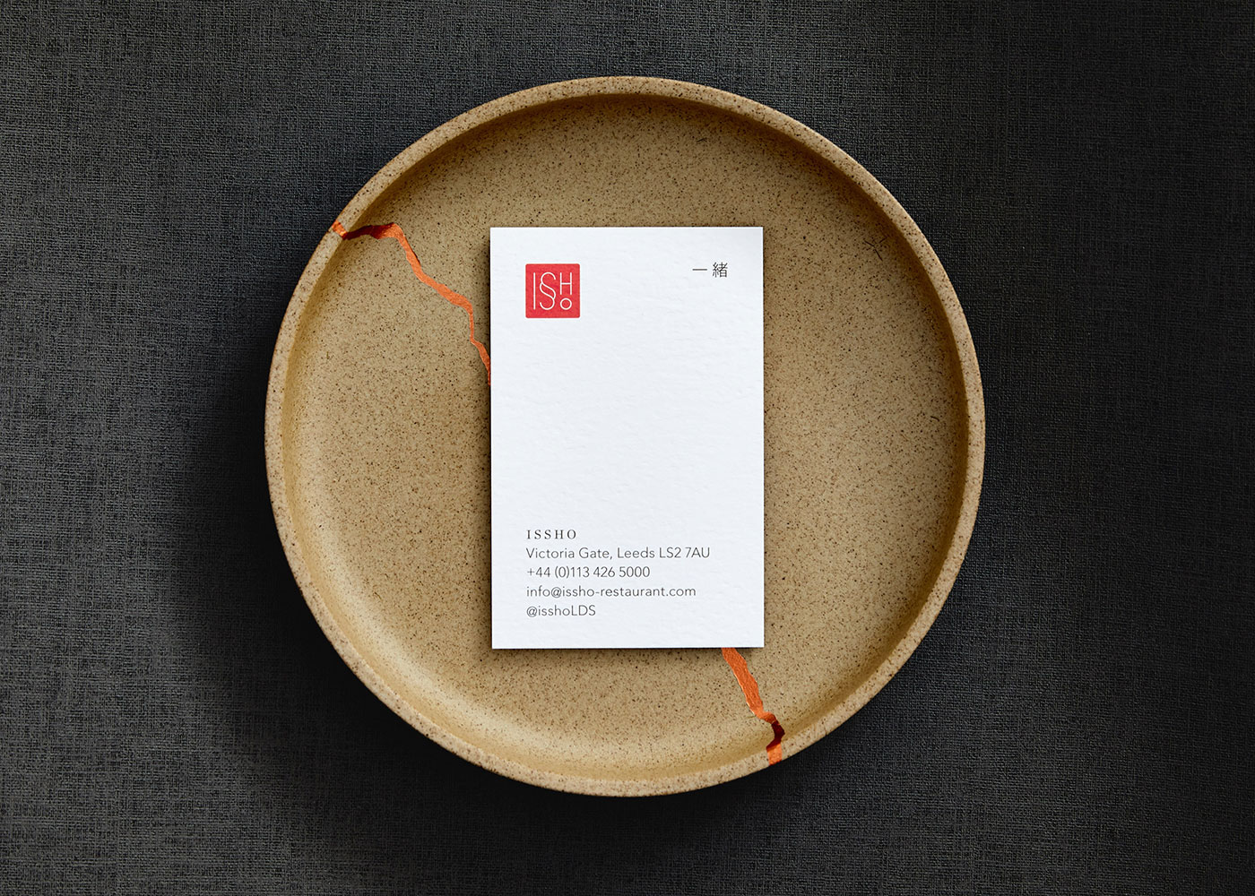
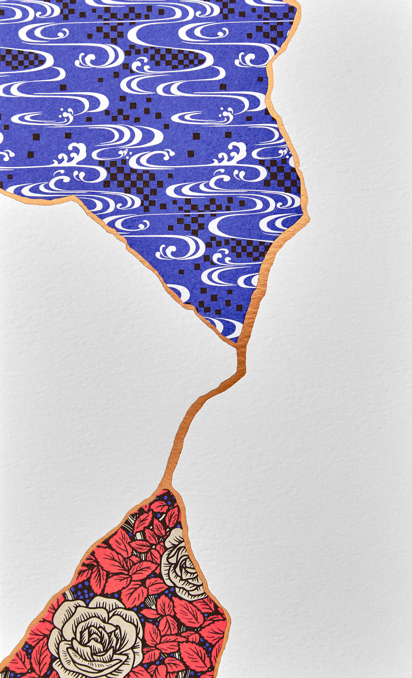
Issho translates as “together” in Japanese, so the idea of “togetherness” was a theme throughout the restaurant branding, with kintsugi being at the very core. Kintsugi is an ancient Japanese art form where repairing an item with gold joins makes the object more desirable than before. Often different pieces of pottery are used like “patches” with varying patterns, colours and textures.
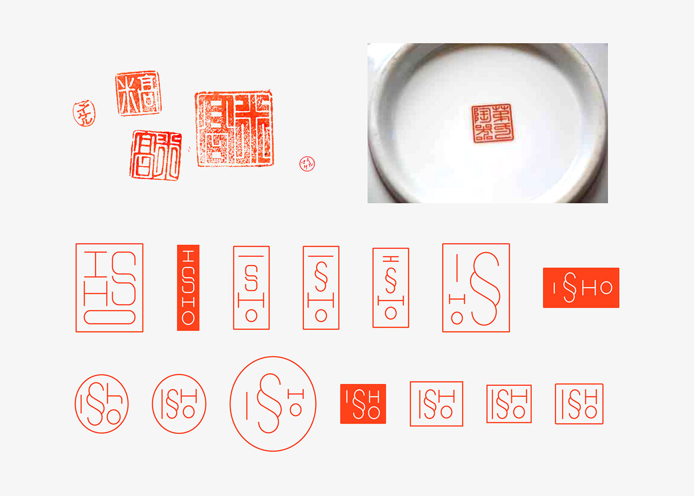
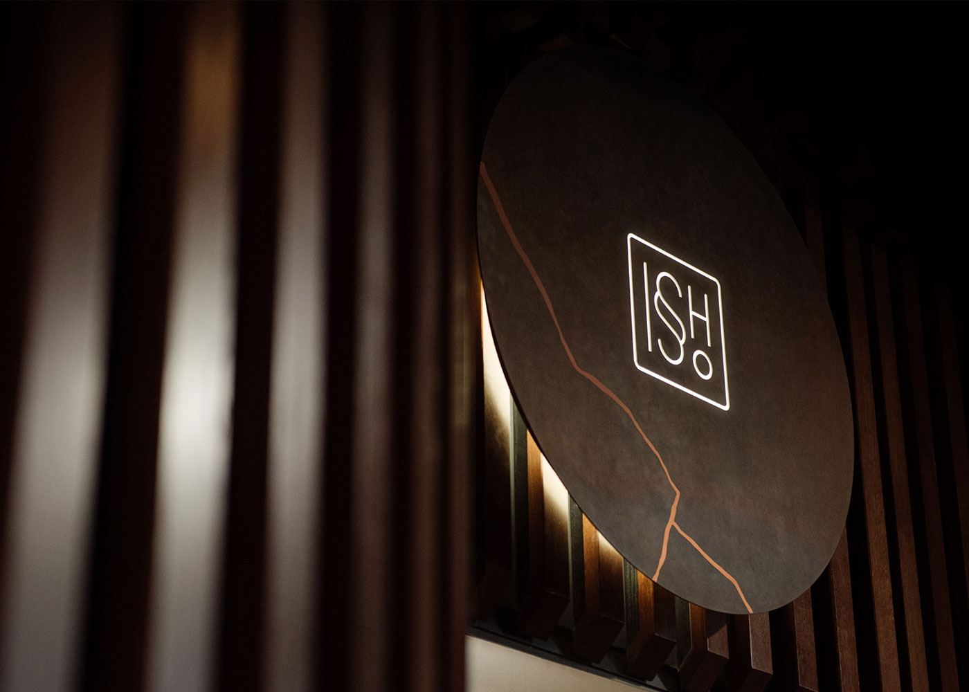
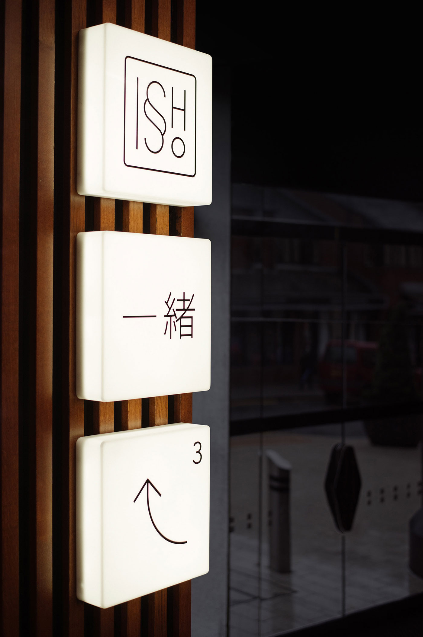
To quietly echo this theme, the logo uses a “double s” glyph within a hanko seal.
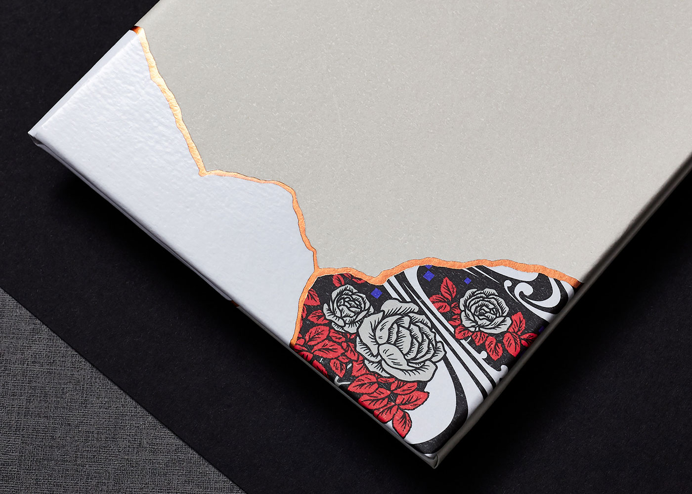
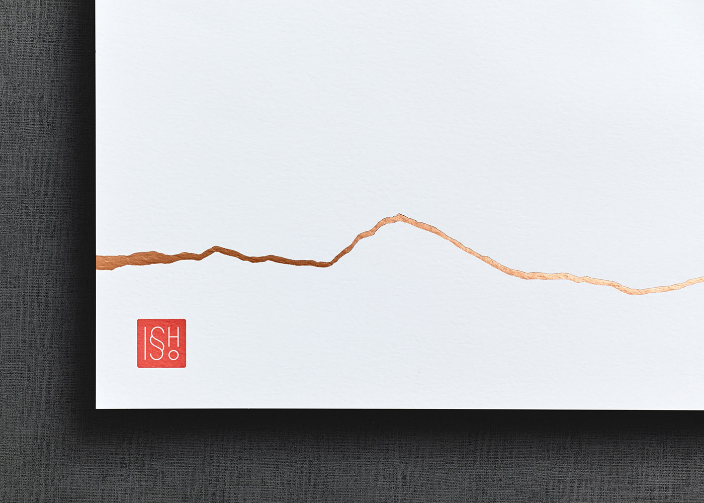
The copper join is used in a singleminded way across all menus and printed items. The join is sometimes on its own in a way that disrupts the copy — like on the food menu — and at other times the join is shown with different finishes and patterns. The drinks menu, for example, has a pattern in one section, a UV varnish in another, and a colour in the third.
In the end what worked best was to simply tear paper and then reattach with a gap and scan. The cracks were then isolated and retouched to get the correct feel. That process was discovered in the concept stage, and worked so well it was carried through to artwork. It was time consuming, especially making all of the printed items connect, but in the end it added an extra level of detail that was really worth it.
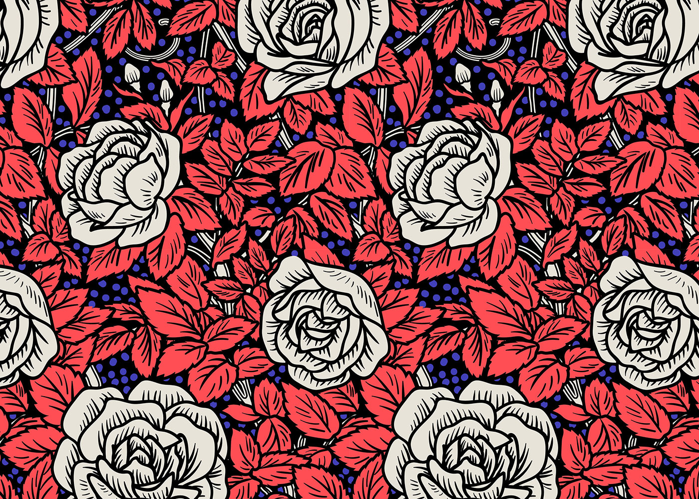
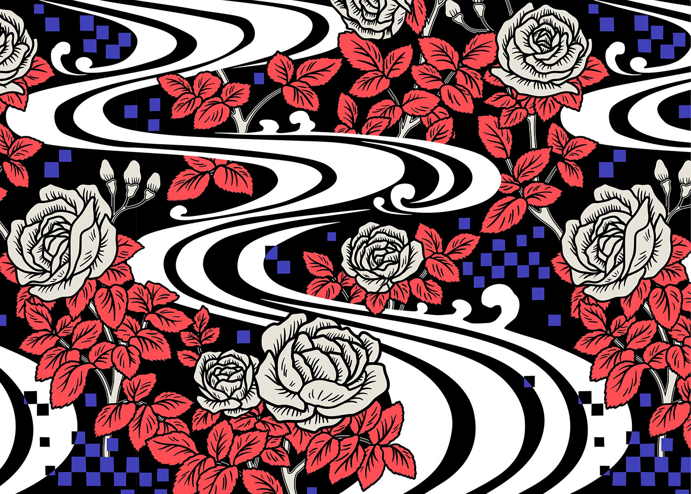
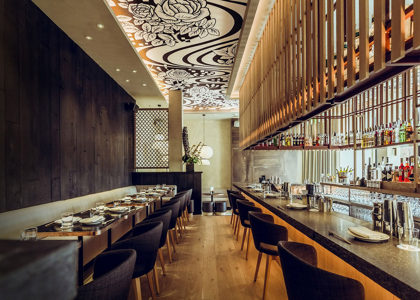
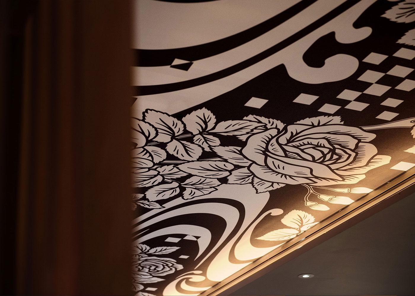
Working with Eley Kishimoto was a real pleasure, particularly seeing how they create modern patterns from traditional sources. They have a very single-minded and concept-driven approach, and were able to apply contrast between the British patterns (embellished, romantic, tight, and filled) and the Japanese patterns (spaced, simple, graphic, and loose).
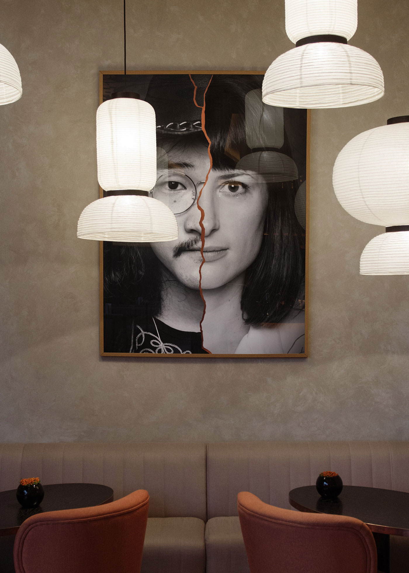
We created six large posters showing Japanese/British people, shot by Laura Lewis and Benjamin Bentley, and joined with copper foil. British and Asian models were sourced and shot in a simple portraiture style.



Comments